MAISON D'OR ESTATES
A concept demo exploring how high-ticket property discovery and enquiry could feel at the top of the market.
- Type
- Concept demo
- Industry
- Luxury Real Estate
- Year
- 2026
- Focus
- Private brochure UX
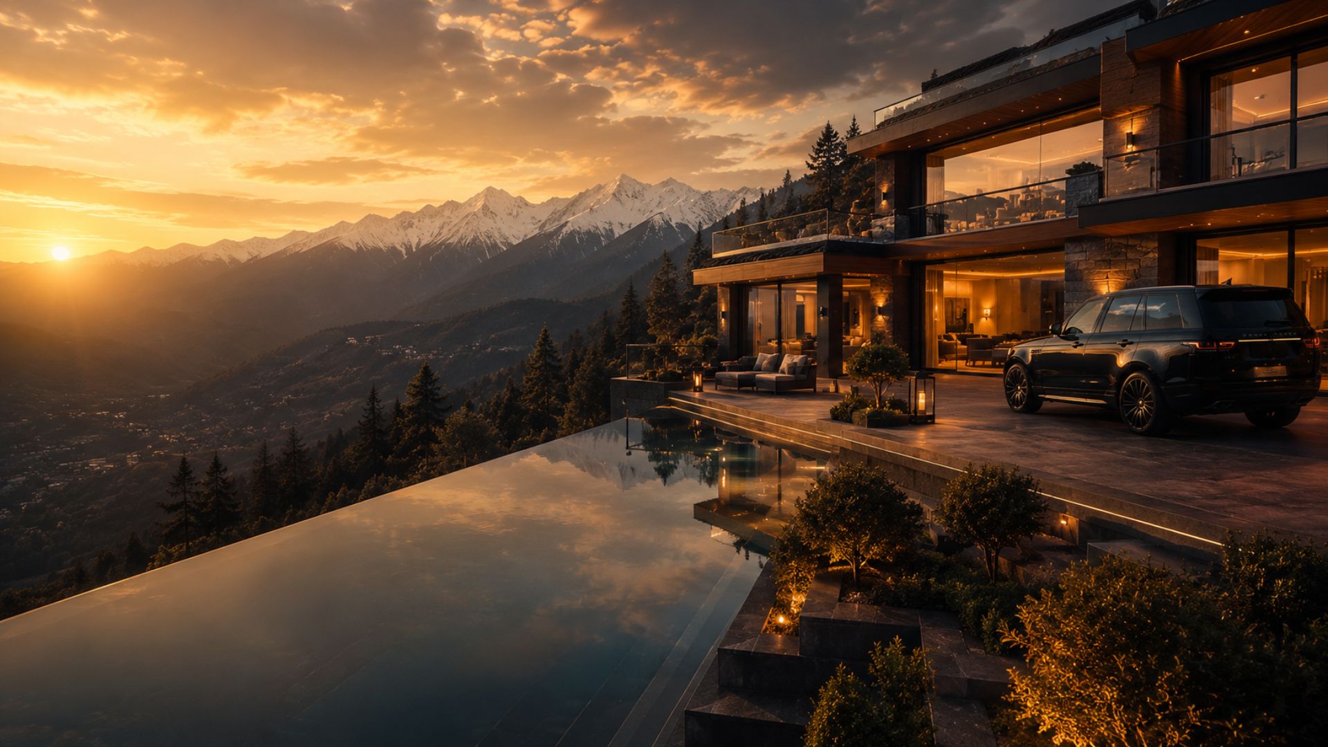
Maison d'Or Estates is a self-initiated exploration of high-value property discovery. Every property, location, price and enquiry in the prototype is fictional. No agency, listing feed, buyer or transaction exists behind it.
01 — Product hypothesis
Twenty properties, not twenty thousand
Most property portals optimise for volume browsing. This demo asks what the interface should look like when there are twenty listings, not twenty thousand, and each one is a considered decision.
Intended user
A considered, private buyer
Hypothesis
Design the brochure, not the portal
Volume patterns sell scarcity. At the top of the market, scarcity is already the product — so the interface has nothing left to shout about.
02 — Rejected patterns
What high-volume portals do, and why it was dropped
Each rejection is a deliberate design decision, not an omission.
Infinite results grid with filters as the entry point
A curated set presented in sequence, so the collection reads as a selection someone made.
Thumbnail-density listing cards with badges
One large photograph per property, given the width to carry the place.
Spec sheets above the fold
A short narrative about the property first; specifications sit below, complete and quiet.
Persistent lead-capture forms and callback bars
A single discreet enquiry route, phrased as a private request rather than a conversion event.
Urgency cues: viewing counts, 'new', 'hot'
No urgency signalling anywhere in the interface.
03 — Primary journey
From curated discovery to a private enquiry
- 1Discover
Curated collection
A short, ordered set of properties rather than a searchable index.
- 2Read
Property story
Location, character and setting told as an editorial spread before any numbers appear.
- 3Verify
Details
Specification, plans and terms presented completely, but visually subordinate to the story.
- 4Enquire
Private enquiry
One restrained request route, with the expectation of a personal reply rather than an automated funnel.
04 — Image hierarchy
Photography decides the layout
The layout system is built downward from a single hero frame, so every property reads with the same rhythm regardless of how many images it has.
Primary frame
One full-width image establishing the property. Cropped to protect the building and horizon at every breakpoint.
Supporting pair
Two secondary frames — interior and setting — sized to support, never to compete with, the primary.
Quiet detail set
Smaller material and detail frames placed after the narrative, for the visitor who is already interested.
05 — Enquiry behaviour
Discretion as an interface property
Placement
Once, after the story
Language
Request, not submit
Fields
As few as possible
06 — Responsive behaviour
An editorial that survives a phone
1440px
Full editorial spread; generous margins preserve the brochure feel.
1024px
Narrative and specification stack; the primary frame keeps its dominance.
768px
Single column; supporting images pair two-up rather than shrinking.
390px
Portrait-safe crops keep buildings centred; the enquiry route stays one tap away.
07 — Role & contribution
Role & contribution
Self-initiated concept demo with no real listings, clients or commercial results. It demonstrates industry-specific UX and frontend execution.
Concept
Self-initiated; no agency client and no commercial engagement.
Art direction
Editorial layout system and image hierarchy.
UI/UX design
Collection, property and enquiry surfaces.
Frontend build
Responsive React and TypeScript prototype.
Listings
All properties, addresses and prices are invented for demonstration.
Boundaries of this concept
- No real listings, agents, viewings or buyers.
- No CRM, MLS or listing-feed integration.
- No enquiry volume, conversion or sales figures are claimed.
- Pricing shown in the prototype is illustrative only.
08 — Outcome
Design outcome
A discovery model suited to low-volume, high-value inventory
Premium visual positioning driven by imagery hierarchy
A clear enquiry path that matches the category's buying behaviour
Reusable editorial component architecture
Want work like this for your project?
Trust Me Studio takes on a small number of projects at a time. If this is the standard you're looking for, start a conversation.