CLEANING KARIGAR
A refined booking experience built for a premium home-care service — client work delivered by Trust Me Studio.
- Type
- Client project
- Industry
- Home Services
- Year
- 2026
- Focus
- Enquiry conversion
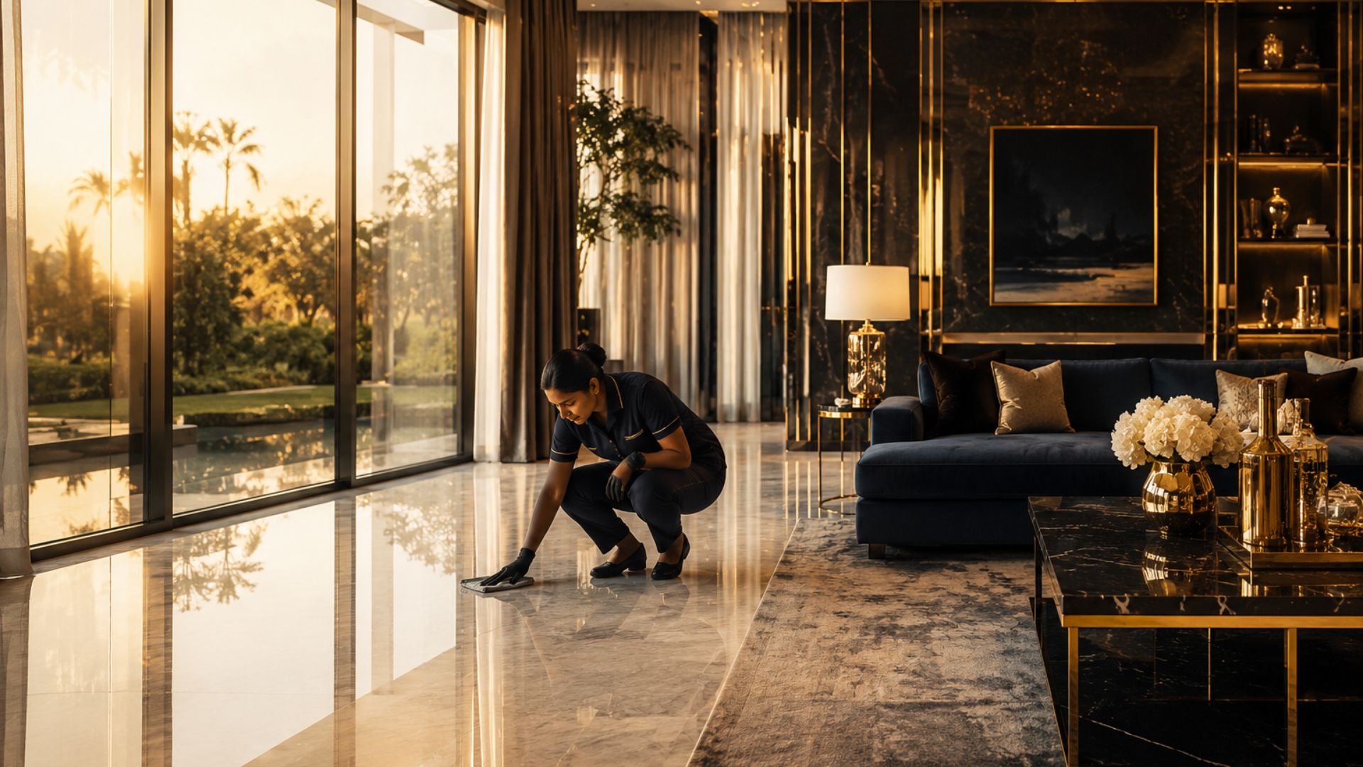
01 — The business problem
A premium service in a category that competes on price
Home-cleaning services compete on price by default. The client needed a booking experience that signalled care and reliability first, so enquiries would arrive pre-qualified rather than price-shopping.
Default category behaviour
Home-cleaning services are usually compared on rate first. Presentation follows that, and the cheapest listing wins the click.
What the client needed instead
Enquiries that arrive already convinced about care and reliability, so the conversation starts at fit rather than at discount.
The design consequence
Positioning had to be visible before pricing was ever discussed, and the enquiry path had to feel effortless enough not to lose that advantage.
02 — Visitor hesitation
What stops someone from enquiring
The layout was organised around the questions a visitor asks silently before contacting a home service. Reassurance was placed at the exact points where those questions appear.
Who is coming into my home?
Reassurance about the service and its standards sits alongside the service description, not buried on a separate page.
What exactly is included?
Each service states its scope in plain language up front, which removes most pre-booking back-and-forth.
Is this going to be expensive?
Positioning is handled through presentation and clarity rather than a price grid, so the enquiry is about fit.
How much effort is enquiring?
The enquiry path was reduced to the fewest steps that still capture what the team needs to quote.
03 — Enquiry journey
The original booking path
Trust Me Studio designed and built the original site: a short, obvious booking path, trust signals placed where hesitation happens, and presentation calibrated to the upper end of the market rather than the discount end.
- 1Land
Positioning first
The visitor understands within one screen that this is a considered service, not a discount listing.
- 2Understand
Service clarity
Plain-language service descriptions with scope stated up front.
- 3Reassure
Trust at the drop-off point
Guarantees and reassurance copy sit next to the moment hesitation happens.
- 4Enquire
One obvious action
A single primary enquiry action, reachable from any point on the page.
04 — CTA hierarchy
One primary action, everything else subordinate
Primary
Enquire / book
The only high-emphasis action on the page. Persistent and reachable one-handed on mobile.
Secondary
Service detail
Supports the decision without competing for the click.
Tertiary
Supporting information
Reassurance and scope content, present where needed and quiet everywhere else.
05 — Decisions & rationale
Choices made for conversion, and their cost
- 01
Shorten the enquiry to the minimum viable questions
Every additional field is an exit. The form asks only for what the team needs to quote accurately.
Trade-off — Some qualification moves into the first reply instead of the form.
- 02
Present at the upper end of the market
Premium presentation filters price-led visitors before they enquire, which raises the quality of the conversations that do start.
Trade-off — Fewer raw enquiries than a discount-led page would attract.
- 03
Mobile-first enquiry placement
Most traffic for local home services is mobile, so the booking action stays within thumb reach throughout the page.
Trade-off — Desktop layout is built around a mobile-derived hierarchy rather than the reverse.
- 04
State scope before contact
Clear service scope reduces mismatched enquiries and shortens the pre-booking exchange.
Trade-off — More copy on the page than a purely visual brochure site.
06 — Scope & attribution
Role & contribution
Client project. Trust Me Studio delivered the original build. The live domain may have been modified by others since launch — only the original scope below is claimed.
Product strategy
The enquiry and booking journey for the original build.
UI/UX design
Layout, service presentation and reassurance placement.
Frontend build
Responsive implementation of the original site.
Conversion structure
CTA hierarchy and copy structure.
Launch
Deployment of the original launch build.
Changes after launch
The live domain may have been modified by others since launch. Only the original scope above is claimed.
07 — Responsive behaviour
Built for the phone in someone's hand
1440px
Wide layout retains a single primary action rather than spreading competing CTAs.
1024px
Service content pairs two-up; reassurance stays adjacent to its trigger.
768px
Single column; enquiry action remains visible without hunting.
390px
One-handed enquiry flow end to end, with comfortable tap targets.
08 — Outcome
Outcome
A single, unambiguous booking path from any entry point
Premium positioning in a category that usually competes on price
Mobile enquiry flow usable one-handed end to end
Client-reported: three enquiries were received within the first 24 hours after the original launch.
No conversion rate, revenue figure or ongoing performance claim is made. The note above is reported by the client and relates only to the first 24 hours after the original launch.
Continue exploring
Want work like this for your project?
Trust Me Studio takes on a small number of projects at a time. If this is the standard you're looking for, start a conversation.