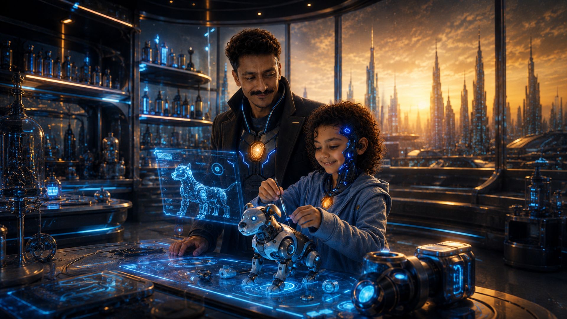
GUNGUVERSE
A family-friendly cinematic universe focused on imagination, wonder and hope.
- Type
- Original IP
- Franchise
- Anchor brand
- Year
- 2026
- Status
- Live
01 — Position in the franchise
The anchor brand, not one of three siblings
Make a family-facing universe that reads as warm and imaginative to younger audiences while still looking credible to the adults, partners and collaborators who decide whether an IP is worth backing.
Warmth was built through colour, character framing and pacing rather than cartoon cues. GunguVerse also acts as the anchor brand for the wider franchise, so its component language and navigation were designed to be inherited by sibling universes.
GunguVerse sits at the top of the hierarchy. EARTH100000AD and ANTERNAAD are sibling universes that link outward from it, which is why its navigation and component language had to be designed once and then inherited rather than re-invented per property.
Two audiences, one page
Younger visitors arrive for the characters. Adults — collaborators and people evaluating the property — arrive to judge whether an IP is worth taking seriously. The design has to satisfy both without splitting into a kids site and a pitch deck.
02 — Discovery model
Visitors arrive through characters, not menus
A menu asks a visitor to already know what they want. A character asks nothing. The entry model was inverted for that reason.
- 1Arrive
A character, full-frame
The first thing on screen is someone to care about, not a navigation bar or a value proposition.
- 2Recognise
Personality before plot
Character framing and copy length establish tone before any story detail is asked for.
- 3Follow
Into the story surface
The character leads into the moment they belong to, so context arrives with emotion attached.
- 4Widen
Out to the universe
From a story surface the visitor can move to the wider world, or across to a sibling universe.
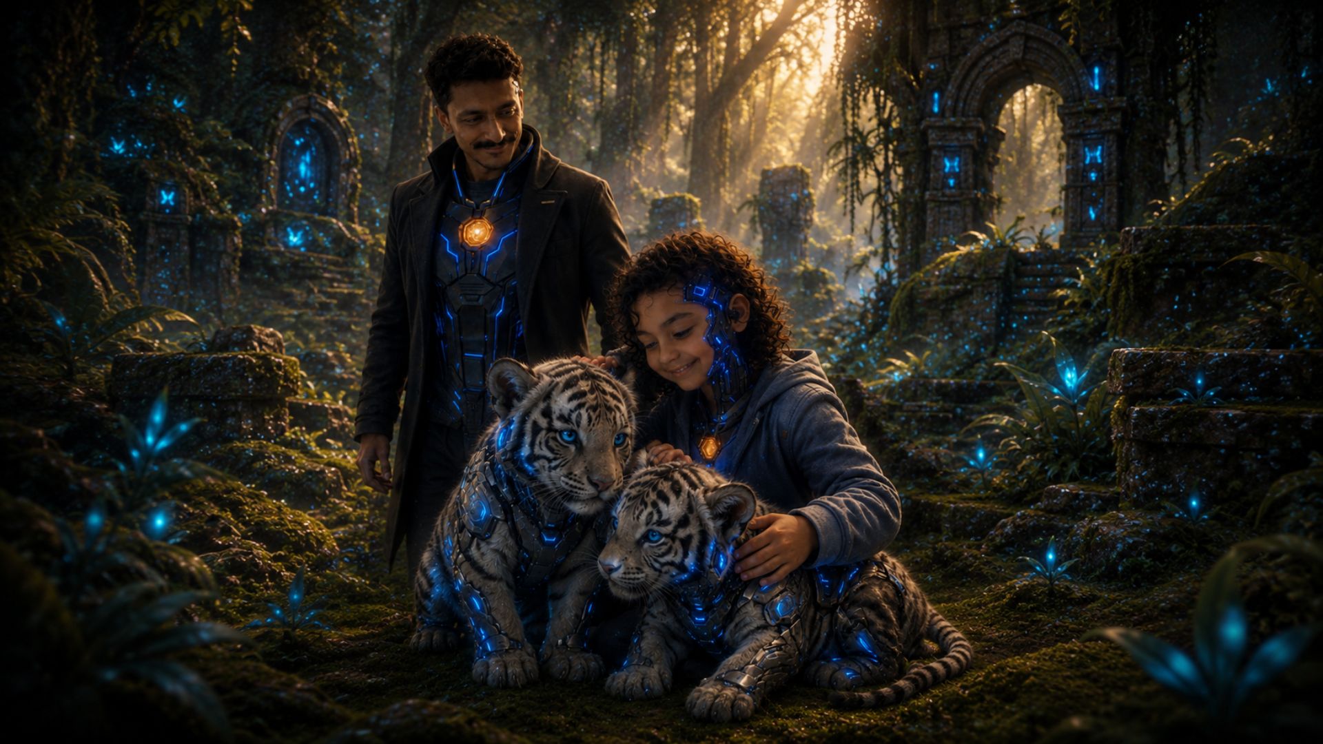
Characters carry the world
Each story surface is introduced by the character who belongs to it — Gungu, Baba Gungu, Rocket Raju and the Cyber Tigers each open a different part of the universe. Framing, scale and copy length change with the character, while the layout primitives stay identical across all of them.
03 — Franchise architecture
What is shared, and what stays local
One design system carries three universes. The split between inherited and local was drawn deliberately: shared where consistency signals a franchise, local where a universe needs its own atmosphere.
Editorial diagram of the structural relationship between the three original universes. No commercial licensing, audience figures or external franchise partners are claimed.
Family-friendly was solved with warmth and pacing — not with rounded cartoon cues that would have cost the property its credibility.
04 — Decisions & rationale
Warmth without infantilising
- 01
Warmth through colour and framing
Tone is carried by palette, character scale and pacing rather than by cartoon conventions, so adults reading the page still take it seriously.
Trade-off — Less instantly 'for kids' at a glance than a conventional children's brand.
- 02
Character-first navigation
Suits younger readers who browse by who they like, and returning fans who arrive looking for someone specific.
Trade-off — Visitors wanting a structural overview need to go one level deeper.
- 03
Pacing tuned for wonder, not information density
Section rhythm, imagery scale and copy length were set to build feeling; the site is an invitation, not a wiki.
Trade-off — Reference-style detail lives deeper in the experience.
- 04
Design system owned by the anchor
Sibling universes inherit primitives, so the franchise stays coherent and a change lands everywhere at once.
Trade-off — Any system-level change has to be evaluated against three properties.
05 — Responsive surfaces
Characters have to survive every screen
1440px
Full-bleed character frames with room for the world around them.
1024px
Character and story surfaces pair two-up without cropping faces.
768px
Media stacks above copy; framing shifts so the subject stays centred.
390px
One character per view, tap targets comfortable, no horizontal overflow.
06 — Role & responsibility
Role & contribution
The anchor property of an original franchise — created, designed, built and deployed in-house by Divyank Tiwari.
World-building & characters
Original universe and cast creation.
Franchise strategy
How the anchor relates structurally to the sibling universes.
Art direction
A family-facing but premium visual tone.
UI/UX design
Character and story surfaces, and the discovery model.
Frontend engineering
React and TypeScript implementation across phone, tablet and desktop.
System maintenance
Franchise-wide design-system upkeep and deployment.
07 — Evidence
What the project demonstrates
A single design system extended across three connected universes
Family-friendly positioning achieved without lowering visual standards
Character-first navigation that suits both new and returning visitors
A brand structure built to grow into a franchise
Want work like this for your project?
Trust Me Studio takes on a small number of projects at a time. If this is the standard you're looking for, start a conversation.