ANTERNAAD
Ancient Indian philosophy meets future technology in an epic mythological sci-fi experience.
- Type
- Original IP
- Discipline
- Art direction + Frontend
- Year
- 2026
- Status
- Live
01 — Two registers
Reverence and machinery, held at the same weight
Hold two registers at once — the reverence of Indian philosophical writing and the hard edge of a technological future — without letting either flatten the other into decoration.
The philosophical register
Indian philosophical ideas are the source material, not a decorative layer. That means slower pacing, more negative space and long-form passages that expect to be read rather than scanned. The interface behaves like something being approached, not something being used.
The technological register
The future in ANTERNAAD arrives as light and structure — glow, alignment, geometry — rather than chrome, HUDs or interface clichés. Technology reads as a continuation of the sacred material, which is why neither register flattens the other.
The interface was treated as a sacred artefact: restrained typography, deliberate negative space and slow reveals, with technology motifs introduced as light and structure rather than chrome. Consciousness concepts drive the section order, not conventional web page conventions.
02 — Philosophy to interface
How each concept became a design rule
Nothing here is a new claim about the source ideas. This is only a record of how concepts already present in ANTERNAAD were translated into typography, motion, spacing, section order and interaction.
Consciousness as the organising idea
Section order follows the arc of the concept being explained, not a hero-features-footer template.
Inner resonance (Anternaad)
Motion is restrained — slow fades and light shifts, never attention-seeking animation.
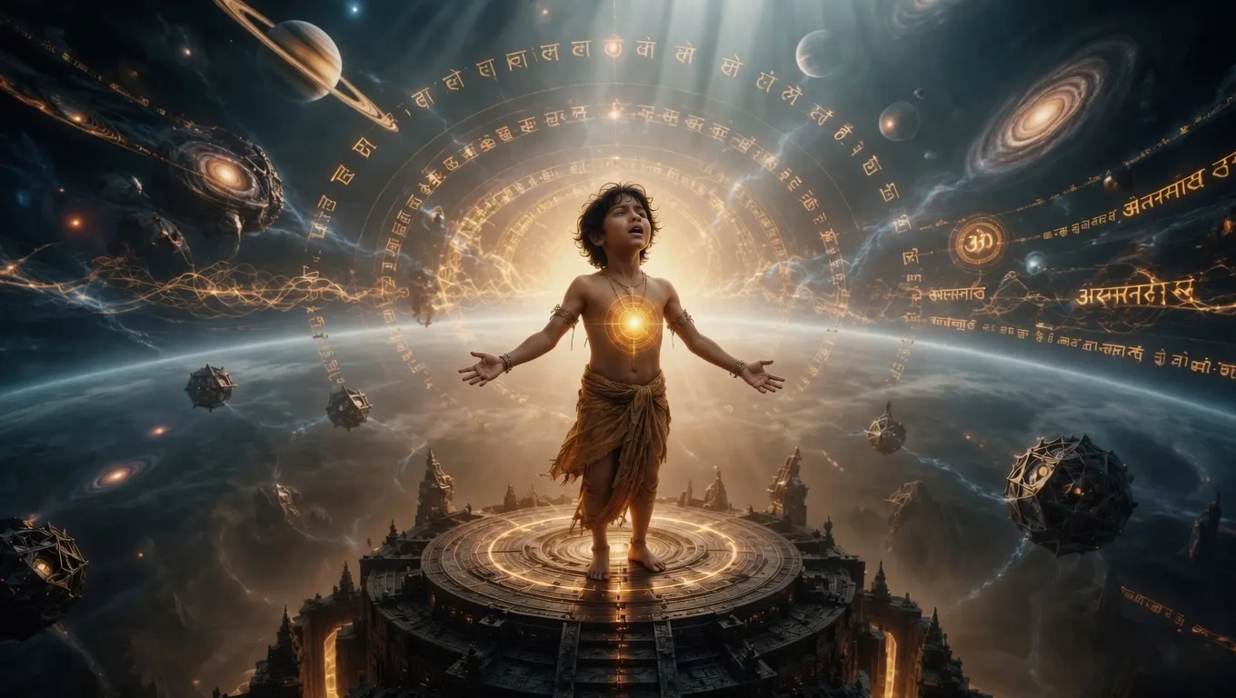
The Sun-Core carried within Aarav
Light is treated as a single focal source per view instead of ambient glow spread evenly.
Reverence for the written word
Measured line length and generous leading; long passages are set as luxury editorial.
Transliterated Sanskrit terminology
Type scale and letter spacing tested against long transliterations so nothing clips or crowds on small screens.
Myth and machine as one world
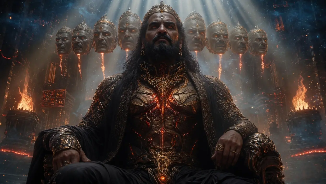
Deity and machine characters share one profile system with distinct visual treatments.
The interface was treated as a sacred artefact — restrained, deliberate, and built to be approached slowly.
03 — The awakening narrative
Aarav, the Sun-Core and the arc the site is built around
Aarav is the child destined to awaken humanity's forgotten connection with consciousness and light. The Sun-Core is the power held within him. Those two facts set the emotional order of the entire experience.
Aarav, the Chosen One
The arc opens on a child who does not yet know what he carries. Every surface after that point is ordered around the moment the Sun-Core wakes inside him — which is why the reading sequence moves from stillness, to recognition, to light.
On the live experience this chapter is where pacing slows most deliberately: fewer elements per view, longer passages, and a single focal light source so attention has somewhere to settle.
Consciousness
Ancient wisdom meets advanced intelligence.
The Sun-Core
A power hidden within Aarav.
The Awakening
The beginning of humanity's next evolution.
04 — Decisions & rationale
Restraint as the hardest choice
- 01
Let the concept dictate section order
Standard web section order would have implied a product. Following the arc of the idea keeps the page reading as a text.
Trade-off — Visitors expecting familiar landing-page structure need a moment to orient.
- 02
Slow reveals over aggressive motion
Motion sets tone here rather than drawing attention, which is what keeps the contemplative register intact.
Trade-off — Less immediate visual excitement in the first few seconds.
- 03
One profile system across myth and machine
Deities and machines belong to one world; separate systems would have visually split the universe in two.
Trade-off — Character pages share structure and gain their identity from treatment, not layout.
- 04
Type tested against transliteration first
Sanskrit-derived terms are long. Scale and spacing were tuned to them before English copy was set.
Trade-off — A slightly more conservative headline scale than the art direction wanted.
05 — Reading behaviour
Long-form on a phone, without shortening the text
1440px
Wide margins hold the measure at a comfortable line length rather than filling the screen.
1024px
Two-column concept blocks; light sources stay single-focal so the tone survives.
768px
Single column reading flow; character surfaces stack with their treatments intact.
390px
Full text preserved; transliterated terms verified for clipping and crowding at the smallest scale.
06 — Role & responsibility
Role & contribution
An original Trust Me Studio property — written, art-directed, designed, engineered and shipped in-house by Divyank Tiwari.
World-building & writing
Original material rooted in Indian philosophical source ideas.
Narrative strategy
The reading arc and the order concepts are introduced in.
Art direction
Sacred-artefact visual direction, light behaviour and typography.
UI/UX design
Lore, cast and concept surfaces across all breakpoints.
Frontend engineering
React and TypeScript implementation, tuned for long-form reading.
Deployment
Launch and ongoing refinement of the live experience.
07 — Evidence
What the project demonstrates
Two conflicting tones held in one coherent visual system
Long-form cultural writing presented without losing readability
Motion used to set tone rather than to attract attention
A repeatable component language across an entire universe
Want work like this for your project?
Trust Me Studio takes on a small number of projects at a time. If this is the standard you're looking for, start a conversation.